Visualizing the spectrum II
Playing around with software defined radio and looking at spectrum visualizations.
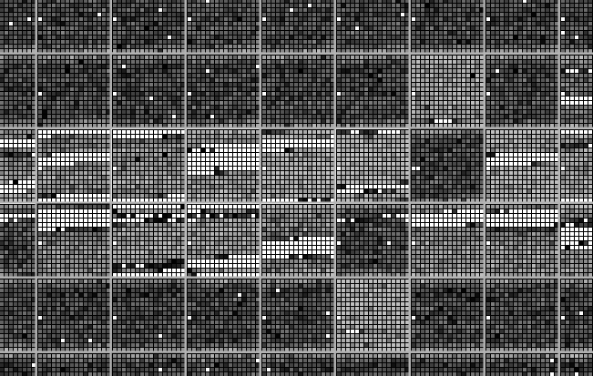
100 Mhz at a Glance
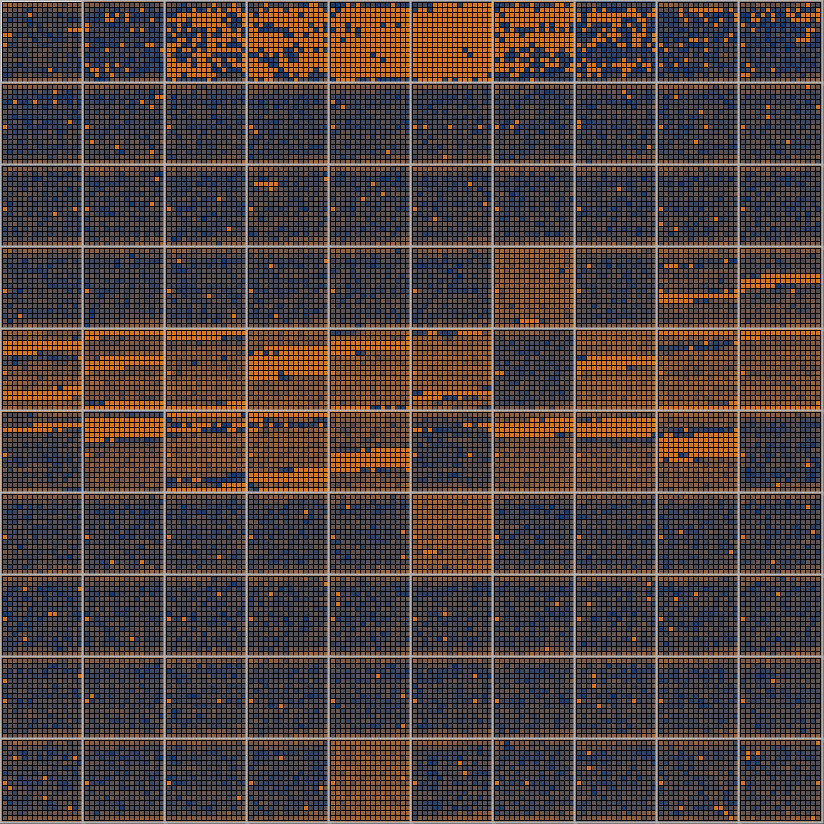
Above is a visualization of a 100 Mhz band, starting from 50 Mhz and stopping at 149 Mhz. The color represents signal strength.
Viz wireframe and Frequencies
Each tile represents a 1 Mhz band. The numbers refer to the base frequency for each zone.
Tile by Tile
Strong

Weak
One tile is a 16x16 square containing a total of 256 inner cells. Each cell displays signal strength for a 0.0039 Mhz slice of 1 Mhz.
The process
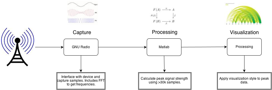
Three steps: GNU Radio captures radio signals and outputs samples with a magnitude ranging from 0 to ~1 (corresponding to about -90db to -60db). Matlab combines the samples to get peak values. Processing creates the visualization.
I Capturing data
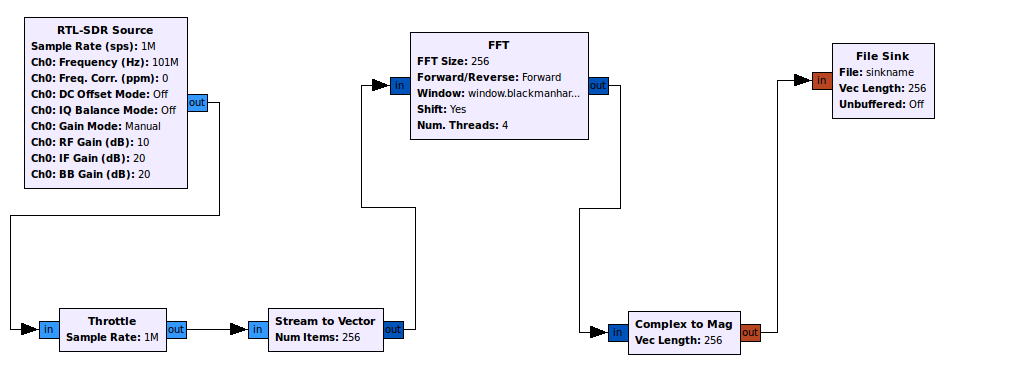
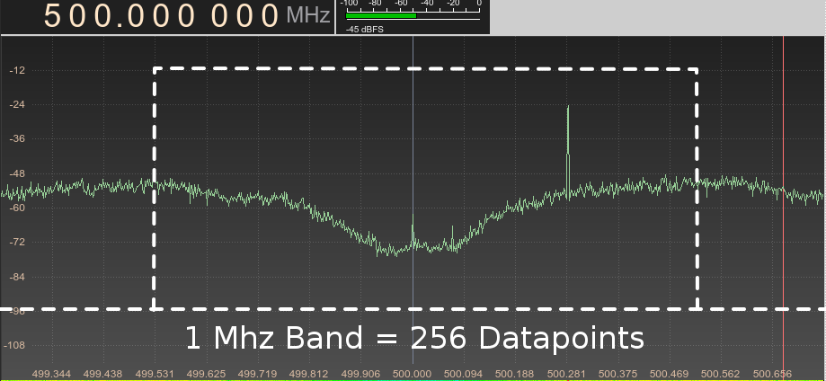
GNU Radio captures the data from the radio receiver, the data undergoes a process called Fast Fourier Transform to convert time to frequencies, after this process is done the data is dumped in a file.
II Processing samples
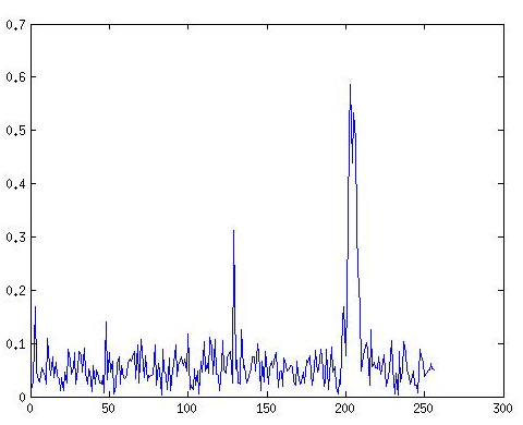
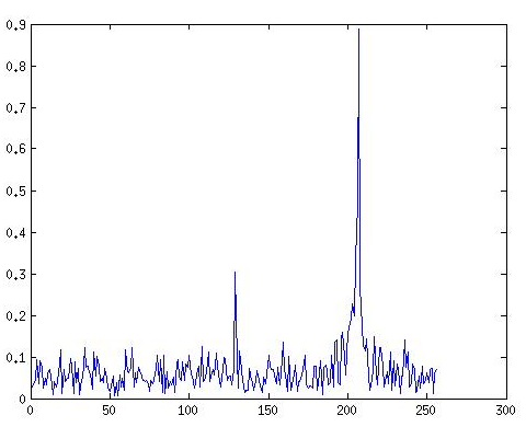
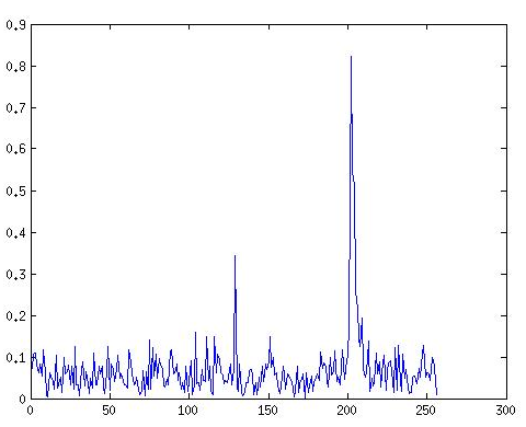
Above are the plots for 3 different samples for 94.5 - 95.5Mhz. A single sample alone is not a good source of data, to have a more reliable source of data multiple samples have to be combined. Different techniques are out there, for this example, I am combining the samples by their peaks.
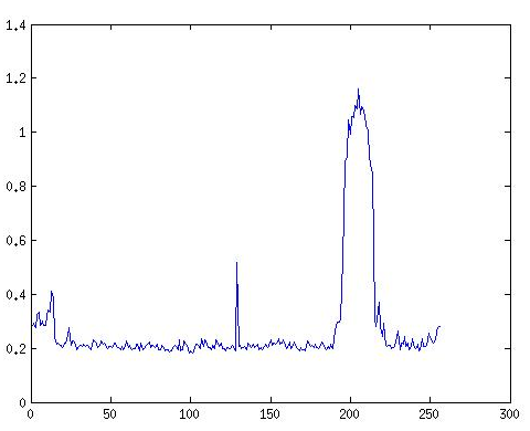
The peak plot looks way more realiable.
III Visualization
Given the number of datapoints, which for a 100 Mhz slice is 100 * 256 = 25600 D3 and svg formats were ruled out. Processing did the job.
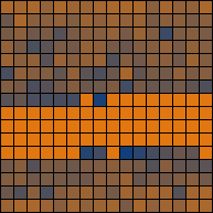
Expectation vs Reality
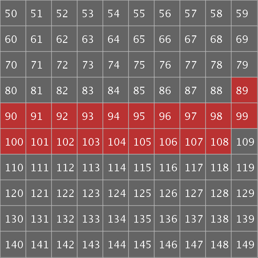
The picture on the left depicts the expectations I had for the viz, high activity around 89-108 Mhz and little activity elsewhere.
The diagram is fairly coherent with the prediction. It would be nice to understand the reason for high signal level around 52-56 Mhz.